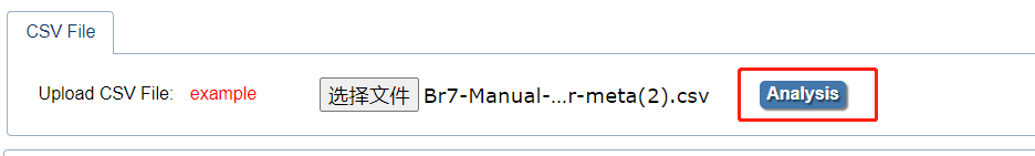
Select the local csv file at the top of the page and click Analyst button.
Then the page will generate 6 types of diagrams:
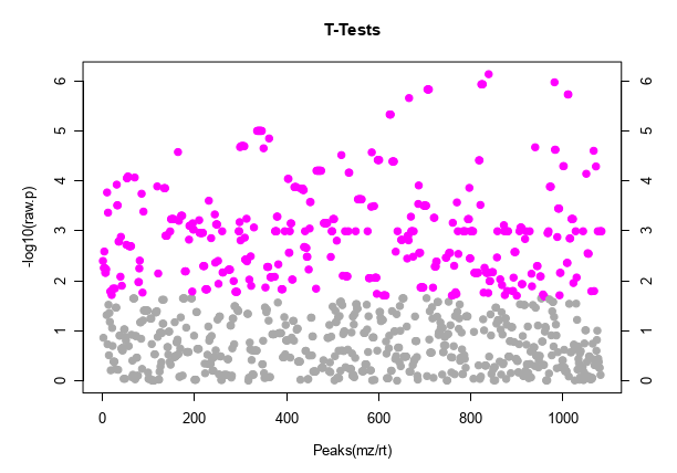
t-test plot: The t-test plot is used to demonstrate the significance of differences in metabolite levels between groups, allowing a visual comparison of whether the differences in metabolite levels between two groups of samples are significant, and shows the significant of changes of each metabolite.
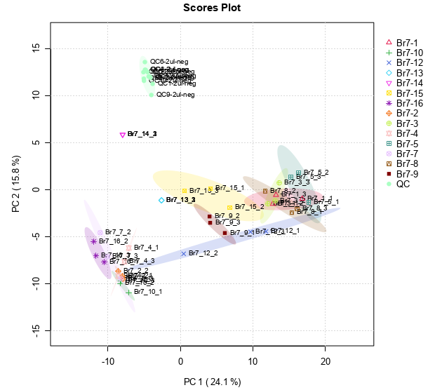
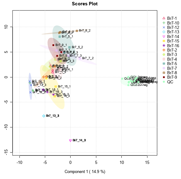
PCA Plot: Principal component analysis (PCA) is a commonly used multivariate data analysis method for down-scaling and data visualization. The plot is a Score Plot for PCA analysis, with the horizontal and vertical axes indicating the first and second principal components (PC1 and PC2) respectively, and the bracketed annotations next to them indicating the percentage of variance accounted for by each principal component, which is used to show the relative position and variability of different samples in the principal component space. The graph expresses the variability of the data in the principal component analysis and the percentage annotation can also be used to explain the extent to which each principal component contributes to the total variance. The 95% confidence level area is marked with same colors of each group.
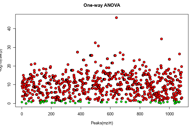
ANOVA plots: Analysis of variance (ANOVA) is used to compare whether differences in metabolite levels between three or more groups are significant. The graph is a one-dimensional ANOVA plot that helps to determine which Peaks are significantly different between samples and can be used as markers of metabolites, while the log-transformation allows the data to be compressed into a smaller range for easy comparison and analysis.
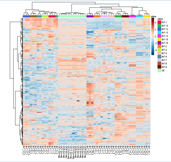
Heat Map: Heatmap is mainly used to show the relative intensity and distribution of metabolite content differences between different groups. It helps researchers to identify the interactions between different metabolites in the metabolic pathway. The colour of each small square in the map indicates the level of expression of the corresponding metabolite in that sample, with darker colours indicating higher levels of expression.
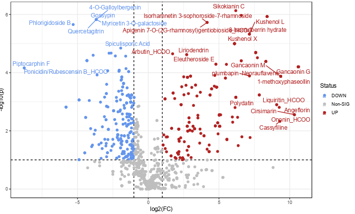
Volcano: Volcano figure is used to show the expression levels and variability of different metabolites in two groups of samples. Each dot in this plot represents a metabolite and its position in the plot reflects their expression level and significance. The darker the colour the greater the variability, while the position on the horizontal coordinate indicates the direction of variation, with the right side representing up-regulation of expression and the left side representing down-regulation of expression.
PLS-DA: Partial least squares-discriminant analysis (PLS-DA) is a common multivariate statistical analysis used to compare metabolite variability between multiple groups to help researchers discover metabolite interactions and further reveal the biological mechanisms involved in metabolic pathways. The graph is used to demonstrate the variability and similarity in the first principal component between different samples, helping to distinguish metabolite differences between different groups. The 95% confidence level area is marked with same colors of each group.
Created with the Personal Edition of HelpNDoc: Effortlessly Convert Your Word Doc to an eBook: A Step-by-Step Guide